Showing posts with label florals. Show all posts

New Theme | Dark Flora

(Sources 1 | 2 | 3 | 4 | 5)

First of all, how on earth is it September already? This time last year I had only a couple of weeks left in my first placement and this year I have just started my new job it really is unreal how much can change or happen in a year. Speaking of which, due to the fact I've moved back home, worked constantly, working on my new blog and spent time catching up with friends this blog has been neglected slightly and there has been no weekly content. I am trying to figure out where I want to take this blog as I have had the same structure for about two years now and want to push it more when I start my own projects. It will take time so stick with me whilst I sort it all out. But I am back to freelancing and working on designs ready for Premiere Vision which I am hoping will bring some success for my designs. You really never know how PV is going to go and there is a lot of competition but all it takes is that one meeting and that one design for someone to pick it up.

So the new theme is Dark Flora which is a theme I have wanted to do for months. Of course it is me, I love florals and so is a great them for me. As with any new project that I haven't really had the chance to do before it comes with is challenges, so the best thing to do at the beginning is to breathe, turn on the music and design away. It will need a lot of working in to and patience to get the layout, colours and florals right. I have this imagined in my head like I do at the beginning of every theme but it is all just about making it fun and enjoying the process of working in to the designs, layering, varying scales and using filters. I've found that during my research I didn't want to look to much in to what other designers have done as I would feel like I had to replicate that rather than take my on approach on it. Some designs can be oversized, smaller, darker, brighter, blurred, layered or mirrored. It really is all about experimenting and if it is not right then just try again or ask for some help. I really enjoyed creating this mood board for it after being inspired on Pinterest for the layout. It really helps to have a mood board for each project and it never has to be a final cut before you start the project as your inspiration can change. Like the name suggest, it just has to replicate the mood or feel of the theme and to pick out little parts from each image.

What do you think of the theme?

Resort 2016 | Stella McCartney

(Sources 1 | 2)

I've finally started my Resort catch up sessions and am picking out my favourite colours, prints and style combinations (you can follow what I'm inspired by over on my Pinterest).
Stella McCartney is the first show I've managed to power through and as always I was inspired by the florals. I love the relaxed large scale florals she has done in soft pinks and oranges that sit perfectly with the flatter flowers which remind me of flower pressing. Her theme of Cuba comes through easily in the garment shapes that are modelled perfectly and makes this simple collection come to life through the cut, shape and material.

Floral Inspiration


1 | 2 | 3 | 4

I love florals. I love interior print designs. So, clearly, I am in total admiration for the floral prints at John Lewis this season. With a vast collection of colours from soft blues, creams, yellows and pinks my mind goes in to colour overdrive.
The overall inspiration for me is the loose hand drawn, water colour look and feel that translates so easily from bedding to cushions and to curtains. You can really brighten up your bedroom with these prints by picking out accessories that match the many colours in the prints.
For my next project, I am creating some hand drawn interior prints and feel really inspired by the prints at John Lewis at the moment. So, it's time to get the watercolours and paper out!

River Island X Pacha Party Look


Dress | White Pacha Sheer Embellished Fringed Dress 

Swimsuit | Pink Pacha Floral Print Corset Swimsuit

Sunglasses | White Rubber Chunky Frame Sunglasses 

Bag | White Question Mark Round Bag

Wedges | White Embellished Front Raffia Wedges

River Island have teamed up with Pacha for their final Spring Summer 2015 collaboration and to celebrate they are holding a blogger competition - so, why not give it a try. If you follow my blog, you'll know I love putting together mood boards, outfits and trends so this project excited me very much.

So, lets talk about this fabulous beach look shall we!

Being a print designer, I was naturally drawn in to a printed swimsuit and loved this floral number from the River Island X Pacha collection. It is feminine, soft and the colours gives off that shimmering sea effect. With it being a corset and having panels down the sides it is sure to be flattering, allowing you to indulge in some summer food and drink. I love the added V-Neck detail which gives it a edgier look.
This 1920s style sheer embellished fringed dress is a simple yet stylish way to cover up and take the beach look from day to night. It adds that lady like elegance to the swimsuit and glamour that speaks for itself. The embellishment on the neck of the dress sits perfectly with the textured raffia wedges with gold tone embellishment to the front. With the rope on the front and heel of this shoe adding texture and building up the look from toe to head and head to toe.
Of course, every girl needs her shades this summer and these rubber chunky frame sunglasses with tinted frames are the ideal way to make sure mark. The silver tone arms compliment the gold details of the overall outfit.
To keep the look fun and flirty, go for this round question mark bag. Round bags are a huge trend for summer 2015 and seen on catwalk shows such as Karen Walker, Rebecca Minkoff and Versace. And if Donatella says a round bag is a must have then who can resist adding one to their beach look this season?

You might be thinking "oh gosh, so much white going on!". Well white is of course one of the biggest colours of the season and a colour River Island have been rocking so well in their stores. So, lets rock our white sunnies and floral swimsuit and head to the beach for a few cocktails and a dance with our friends! And what shall we be dancing to you ask? Well, my summer theme tune is Wake Me Up by Avicii. It takes me back to my summer holiday spent in Toulouse, France where I sipped wine and soaked up the sun.

Whats your beach look this season? And what will be your summer song?

Prints | Top 5


1 | 2 | 3 | 4 | 5

This weeks TOP 5 is very much a floral / inky one (two of my favourite themes).
My top print comes from Karen Millen and for the past few weeks since seeing that dress in the window of my local store, I have not stopped looking at it. I don't normally like dipped hems, but for this dress I will take it and (try) to rock it. The running fluidity of bold colours alongside the intense blue and green just makes this a perfect placement print.
The all over floral print from Reiss (2) is just visually beautiful and bursting with colour ready for spring. With hints of black and white florals that have a hand drawn feel balance out the water marks and loosen the intensity. The gorgeous 100% silk crepe de chine has been digitally printed and is also from Reiss. That fabric was one of my favourite materials at college and University and I would love to get my hands on this top, which also comes in trouser and jump-suit form. Wear it to work, a lunch date or even a party. It is one of my absolute favourites that will brighten up any wardrobe. 
I would never wear those Topshop trousers (4) as they are, for me, a bit too daring of a bottom garment. But, with William Morris prints rocking the high street, I couldn't help but be caught up by these beauties. The simple colours and running smoothness of such a print fits Topshops style so much right now. 
The inky loosen of print five is from a Jigsaw t-shirt dress that caught my attention. The loosen plays a big part in that attraction for me as it can denotes freedom and movement and very much reminds me of marks I used to make when drawing at University and for previous freelance designs. 

I've payed slightly more attention to a more luxurious side of the high street market compared to Topshop and my previous picks from other high street brands. I tend to fall deeply in love with stores like Karen Millen and Reiss every so often, dreaming endlessly of wearing this style of clothes and prints.

Which is your favourite? Would you pay more money for a little more excitement in a print or for more of a natural fabric?

Woop! Yeah! Moment


It's always quite exciting when you reach the end of a design that has been challenging and taken you days and days to complete. It's even more of a Woop! Yeah! moment when it sells ... and it sells in New York. My first freelance design recently sold on a sales trip in New York and it couldn't have made the start of my freelancing career chapter better. I was excited to learn that my first collection, based around fragmented florals, who going to New York but I became ecstatic when I learnt I had sold a design that couldn't have been more painful to finalise.

Freelancing so far has been a great challenge. Yes, it has been a bit scary at times because you have to guide yourself a lot more and make your life fit in around designing for hours on end. But, the themes and ideas are endless excitement that only gets better when your work is greatly received.

So, here is to more of them Woop! Yeah! Moments. I hope there are more to come.

The Print Mix | Clover Canyon | Fall 2015

With a collection inspired by the Bronte sisters, Art Nouveau and Edwardians it was hard not to fall in love with Clover Canyons Autumn/Winter 2015 collection. Smokey hues of burnt brown, deep green and dusty rose fell on beautiful and feminine shapes that shouted Boho Seventies (a trend that doesn't seem to be dying down anytime soon) with an Edwardian twist. 

Tapestry florals, embellishment and layered print mixes came together with a variety of fabrics from lace, velvet, fleece and the brands signature neoprene. 
What attracts me most to Clover Canyon, and the reason behind the beginning of my love for the brand, is the amazingly clever way they manipulate a combination of prints that sit so well on the fabric and shapes together. The attention to detail is admiring and I could only wish to create prints like these.

See the whole show at Vogue or Style. 


Autumn Winter 2015 | Topshop Unique

Between working, creating, gym, eating and sleeping I am slowly getting a chance to look at some of the A/W 2015 shows. London is one I have been very excited about with runway looks coming from Erdem, Burberry, Christopher Kane, Mary Kantrantzou and many more to look forward too. 
Of course, Topshop Unique is always on the "must see" list. I have been a fan of Unique since it started and based one of my second year collections around creating looks for this brand. (They do it a thousands times better than I did).


I loved the collection full of mixed coloured furs, dreamy creams, cable knits, luxurious embroided velvets, tweeds, corduroy blues and my favourite pieces (of course) included florals.
It was an English Garden for the English Chelsea Girl and I want every single piece that featured the wilds of the English countryside in the form of dandelions and thistles. 
The models were stunning also and provided us with a guide to create the simple English look for those cold months with the windswept, wavy hair and blushed cheeks. 

View the full collection here.

Follow me on Pinterest to see what A/W Looks I am pinning to my board and being inspired by.

Spring / Summer 2015 Trends

The array of Spring / Summer trends have been extremely exciting to see being a printed textile designer. My favourite trend of florals are being abstracted (Chanel) and camouflaged (Topshop) next season, along with floral embellishment (Oscar de la Renta) and the 60's style Mary Quant look (Jeremy Scott).


The 60's and 70's is going to be a huge trend as seen at Roberto Cavalli, Jeremy Scott, Chanel and Saint Laurent. What is very inspirational for me is the print mix that is visually stunning at Stella McCartney and Preen. This is a trend I would like to try and practice after finishing my latest project.
Stripes and spots are back in once again but being re-developed by designers to be bigger and better next season.

It will be interesting, after researching more in-depth to Spring Summer 2015 trends, how the high street represent these trends within their brands and key stories. Plus, I look forward to working on some these prints myself with the new skills I learnt whilst on placement.

Urban Outfitters | Inspiration


George @ ASDA Placement


After two very hectic and hard weeks, I have completed my George placement. It was an amazing experience and opened my eyes to the world of high street fashion and what it takes to work as team to create a range of garments suitable for a certain theme and customer.

There is a lot more to print design for the high street than just sitting and drawing on the computer all day. You have to research thouroghly for key trends and inspiration before creating a mood board for the story you are working on, which then leads on to the start of creating the prints. The print designers at George had to work quickly to meet the demand of the ladies wear team and on a variety of themes at one given time for seasonal trends next year.

I worked across the board on the jersey ladies wear department by supporting design, trend and strategy meetings, creating fabric trend books, selecting images for and producing key trend moodboards, attending fit meetings with buyers and fabric technicians and participating in sale meetings. Each day was different to the next and the hours were full of new things to learn and information to take it. At the end of most days I sat on the train scribbling down notes of what I had learned so I could always reference in the future.

The building itself was quite overwhelming due to the size of the building and the amount of people that worked there. It was an incredible chance to have the complete opposite experience of what my first placement offered me. And, as I have said to a lot of people, I am very lucky to have two placements that have offered me different positions, learning opportunties, skills, and knowledge for the industry I am keen to work in. The team were nothing but friendly and always at hand to answer any questions I had about the goings on of the industry.

I hope my next placement or experience, wherever that may be, is as rewarding and useful as this one.


Whilst I was at George I was given a short project to create a range of prints for a strong Summer 2015 trend. I decide to focus my attention on the 60's trend, as seen at Henry Holland and Orla Keily, with funky, cute florals and spots being my main detail. It was interesting how the print team created their prints, with new skills being learnt on how to design for rotary screen printing and recognising the difference between rotary and digital printing more now than what I did. 

I had the chance to make my collection look very professional with the use of garment cad and moodbaord headers. Moodboards are always something I have worked on, but the style and use of the George mood boards opened my eyes as to what to look for when creating them in the future. The don't have to be jammed packed full of images and have thousands of colours. Simple but effective is key. 

For all the prints I created at George, visit my online portfolio here

Topshop | Inspiration

Topshop is my go to for print inspiration a lot of the time. I get instantly taken in by their perfect combination of geometric, floral, pasley, scarf and ditsy prints and how I could translate little aspects of each in to my own work. 


Experimenting Designing Cards


Anthropologie | Floral Inspiration


I've always known of Anthropologie but never really looked at their prints for inspiration before until I popped in to Selfridges at the weekend. I was instantly drawn in to their home collection of prints and decided to see what else they did.
Their florals immediately caught my eye as they are so visually beautiful and I just had to put together a mood board for future reference as florals is always a more thing in textiles.
The play on mark making, digital manipulation and placement is interesting and quite different on each garment. The combination of solid areas of pattern to more negative space is partly key to these prints working, alongside the softer and experimental handwriting. All of this gets me very excited to look closely at these in my spare time and experiment with new skills learnt on placement to achieve these kinds of patterns. 

All images taken from Anthropologie.

Designing With A Graphic Tablet

Since buying my Wacom graphic tablet in the early days of my placement I have seen a small change in not only my approach to designing, but the outcome as well. I feel like I take the task of designing something more seriously and have more patience with working on a good repeat. Using the graphic tablet, despite the small size, allows me more freedom to work tools such as different brushes to achieve various lines, lasso tool, rotation, effects and so much more. I was inspired to get one after seeing how the designers at Pattern use them and the ability it give you to have more freedom in terms of what you can design. It is literally like drawing on a piece of paper … except its on a screen. I highly recommend anyone in design to get one.


New Experimental Designs

After seeing on placement the amazing prints the designers are creating with their graphic tablets and asking about them so much I decided, with some spare pennies, to go and buy a small one to get the ball rolling and start practising with … And I am so glad I did. The possibilities and the creativity you can achieve with a graphic tablet are endless and I am having fun exploring how I can push myself. I have a renewed excitement about design if you will.

I have quickly put together over the past few days two new florals designs, both very different but both using the brush tool to create the florals and colour them in.


LK Bennett | Winter Florals | Inspiration

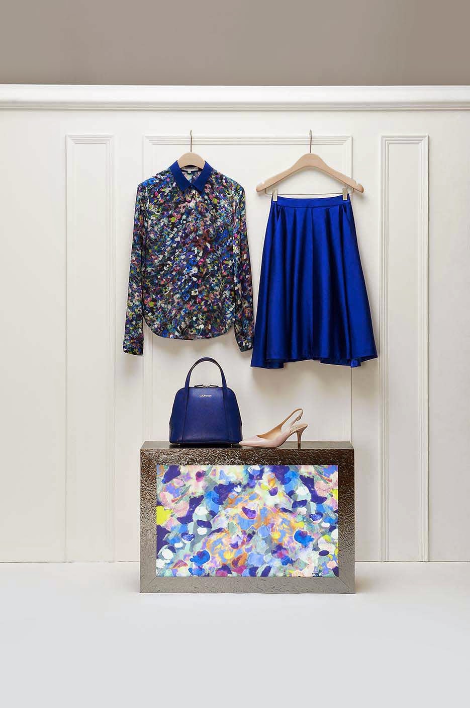
When I arrived in St. Pancras yesterday on my move to London, I walked past all the shops as usual and was actually overwhelmed when I came to LK Bennett and saw their new floral print. It is beautifully stylistic and so feminine. It shouts LK Bennett at you … and I want it. I can guarantee every time I see this print I will want to just stare at it for a while to take in all the detail and the soft play of colours. The print, as part of their Winter Florals collection, is on skirts, shirts (my favourite) and dresses.


Set your style in bloom even in the coolest climes with our new season Aurora floral print. Inspired in part by wintry flora and also by the Aurora Borealis light display from which it draws its name, this painterly pattern will enliven every look. From dinner to dancing, we spotlight the pieces guaranteed to become your Prince Charming. - LK Bennett


Go and shop the collection and more beautiful prints over at LK Bennett
Powered by Blogger.