Showing posts with label moodbaords. Show all posts

New Theme | Dark Flora

(Sources 1 | 2 | 3 | 4 | 5)

First of all, how on earth is it September already? This time last year I had only a couple of weeks left in my first placement and this year I have just started my new job it really is unreal how much can change or happen in a year. Speaking of which, due to the fact I've moved back home, worked constantly, working on my new blog and spent time catching up with friends this blog has been neglected slightly and there has been no weekly content. I am trying to figure out where I want to take this blog as I have had the same structure for about two years now and want to push it more when I start my own projects. It will take time so stick with me whilst I sort it all out. But I am back to freelancing and working on designs ready for Premiere Vision which I am hoping will bring some success for my designs. You really never know how PV is going to go and there is a lot of competition but all it takes is that one meeting and that one design for someone to pick it up.

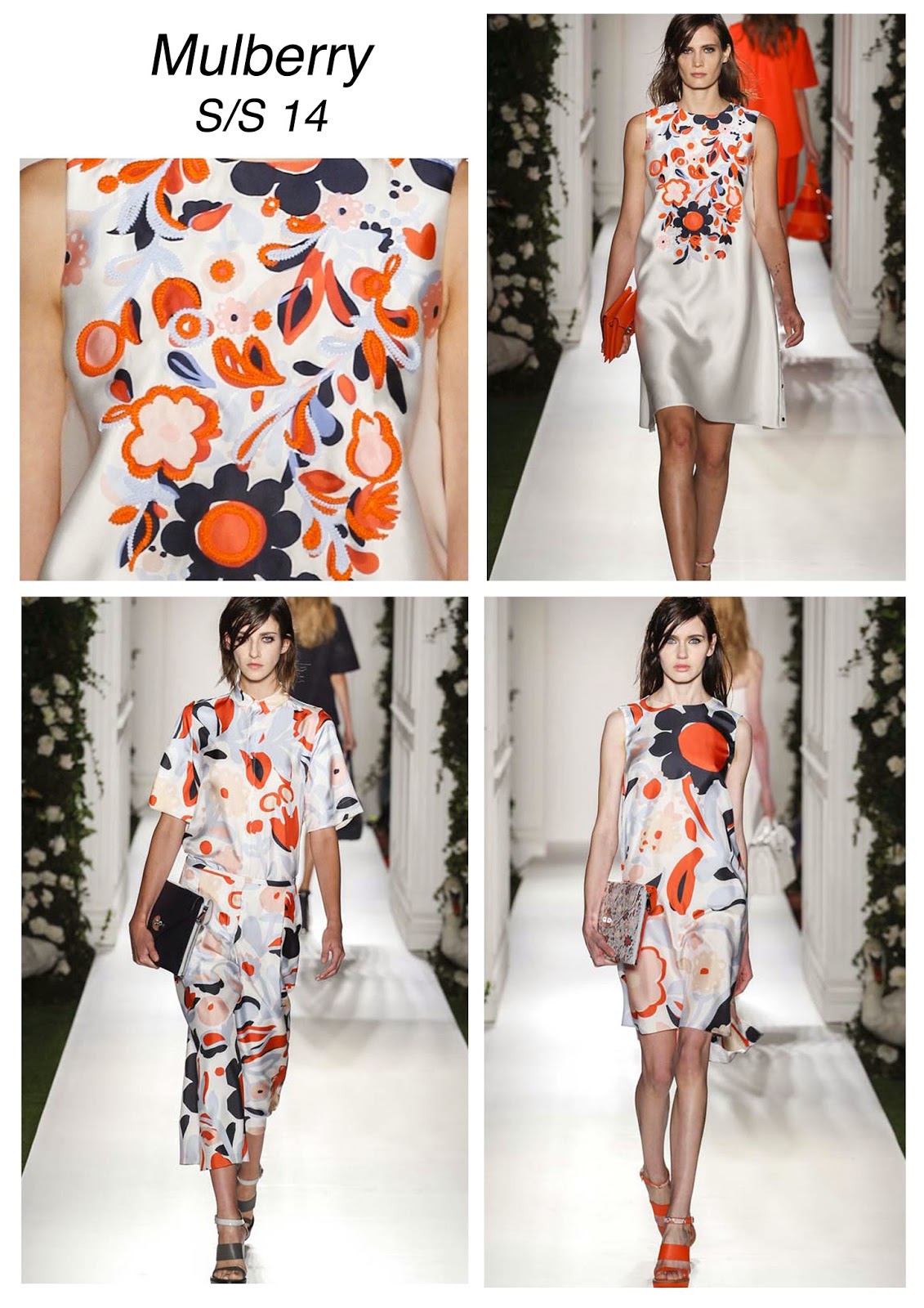
So the new theme is Dark Flora which is a theme I have wanted to do for months. Of course it is me, I love florals and so is a great them for me. As with any new project that I haven't really had the chance to do before it comes with is challenges, so the best thing to do at the beginning is to breathe, turn on the music and design away. It will need a lot of working in to and patience to get the layout, colours and florals right. I have this imagined in my head like I do at the beginning of every theme but it is all just about making it fun and enjoying the process of working in to the designs, layering, varying scales and using filters. I've found that during my research I didn't want to look to much in to what other designers have done as I would feel like I had to replicate that rather than take my on approach on it. Some designs can be oversized, smaller, darker, brighter, blurred, layered or mirrored. It really is all about experimenting and if it is not right then just try again or ask for some help. I really enjoyed creating this mood board for it after being inspired on Pinterest for the layout. It really helps to have a mood board for each project and it never has to be a final cut before you start the project as your inspiration can change. Like the name suggest, it just has to replicate the mood or feel of the theme and to pick out little parts from each image.

What do you think of the theme?

New Theme | Freelancing


(Source: Vogue UK)

After a little break from freelancing it's time to get back in to it and create as many design groups as I can before Premiere Vision. My last collection was a William Morris inspired one and this new collection is also based around the idea of his work, but more inspired by the Valentino Spring Summer 2015 runway collection. I achieved a good outcome with the last group and I'm very excited about this new theme. Of course, I'm a little wary and scared as I always feel about taking on a theme I haven't experimented with before. I have a constant look in my head of how I want the designs to look and try not to feel disappointed when the outcomes don't match the ideal look in my head. But, overall, it's about experimenting and testing myself and my design skills. There is always something to learn from designing a collection and to use those for future themes. 
So, lets get designing... 

Competition | Bohemia

"Inspired by the catwalk shows of Etro, Valentino and Burberry, "A Travellers Dance" captures the Boho style. A colourful and unique print designed by hand that layers a fee-flwing repeat with a visually eye-catching boarder".

I recently entered the latest Textile Federation competition entitled "Bohemia" which I somehow manage to squeeze in to my busy schedule. I was quite excited by the project so wanted to give it a go and use this as a base to test my graphic tablet skills. I designed the print using various internet found paisley and indian woodblock designs which I then changed slightly using different brush marks that had a sketchy and relaxed edge to it. I then use copyright free designs for the boarder (which were slightly modified) that fit in with the half drop design of the main print. I was really inspired by the way Burberry had simple straight block repeats in a two colour way in their A/W 2015 collection (bottom right) and wanted this for the boarder rather than Etros dip-dye hem from their S/S 2015 garment (bottom left). This print, however, gave the the idea for the main repeat of my design which I decided to make slightly more busy and use warmer colours as well as the purples and blues. There is so much inspiration for the Boho style print and pattern so I could have spent a lot longer design this print in real depth, but competition deadlines call and submission is a must! I am quite pleased with the overall look which still carries my handwriting. Every project definitely teaches you something and this one taught me to not be afraid so much of an open brief. And yes the mood board is a great reference, but what it does and should do is in the name and allow that mood to be felt but not have to follow whats on the board so tightly and restrict design freedom.


Lesson learnt! Next project please!

See the design over at Textile Federation.


Resort 2016 | Issey Miyake

(Sources 1 | 2)

I'm not a huge fan of tropicals and tend to avoid them in my own work and in my wardrobe, but when I saw Issey Miyake's Resort collection I begun to like tropical prints that little bit more.
The colours used are what draw me in the most with lush trend and burning reds and pinks. The blend of tropical greens with earthy blues are a perfect combination against the softer greys and whites. The creative director, Yoshiyuki Miyamae, and the team have combined visits of tropics amazingly well and even experimented with its 3-D stretch technology (which I am to get my head around still) that is visually stunning on the outerwear pieces. 
Textile technology and print at its best!

Resort 2016 | Stella McCartney

(Sources 1 | 2)

I've finally started my Resort catch up sessions and am picking out my favourite colours, prints and style combinations (you can follow what I'm inspired by over on my Pinterest).
Stella McCartney is the first show I've managed to power through and as always I was inspired by the florals. I love the relaxed large scale florals she has done in soft pinks and oranges that sit perfectly with the flatter flowers which remind me of flower pressing. Her theme of Cuba comes through easily in the garment shapes that are modelled perfectly and makes this simple collection come to life through the cut, shape and material.

Colour Crush #1


1 | 2 | 3 | 4 | 5

I, like many designers, have certain phases of loving one or two colours that can lead to colour addiction and buying or wearing it constantly until the next colour crush comes along. At the moment mine is definitely Copper Orange, named Dulux's colour of the year. Not only is this colour huge in interiors it is also featured in many Spring Summer designer collections including Tome, Lanvin, Theory and Barbara Casasola. It has also filtered down to the high streets and my eye has tracked in down in Zara and H&M. My colour crush won't end when the Summer season is over and the Autumn/Winter collections start coming in to the stores as its a big colour trend for the next season as featured in the runway shows of Alberta Ferretti, See by Chloé and Open Ceremony.

The Comparative Shop #7


 1 | 2 | 3 | 4

It was slightly harder to pick my favourite four prints this week. Nothing has truly caught me off guard apart from this William Morris style print from H&M (1). The colours are sweet and simple but I was really struck with how well done the detailing is. Marks like lines and dots make up the print which twists and turns in a non-directional repeat. 
Floral prints that I have seen recently tend to be created using marks, lines and a build up of colours much like the shirt from Zara (2) and the shorts from Urban Outfitters (4). Zara's printed shirt has a small scale in comparison to the shorts which I like better. 
Of course, I love a paisley print and was really excited by this paisley printed shirt from Warehouse. The navy base colour works so well with the mint greens, yellows and oranges of the print and the scale is the perfect size and print direction to create a flattering look.

All prints are (again) so different this week. What was your favourite?

The Comparative Shop #6


Shop these looks 1 | 2 | 3 | 4

Every week for the past month or so I have been blogging my favourite five prints from browsing in-store and online which I have really enjoyed. It's made me more aware of what trends are filtering down from the catwalks, more aware of the different styles of high street stores and made me aware of new brands. But now I have decided to change the look of how I present my comparative shop after being inspired my a River Island look book magazine. As you probably guess by reading my blog often I love putting together mood boards and making presentations of my inspirations in neat little layouts.

This week I have been inspired by quite a mixture of prints. The first being this conversational bug print from Urban Outfitters. With its retro feel it is a fun and easy wear, with the softest material and minimalist drape cut. I am also a really big fan of the base fabric colour which is a deep green navy. Who doesn't love a fun conversational print?
Of course, Zara has been a winner with me this week and I have fallen in love with these florals shorts with a flowing cut and high waist. It is a perfect summer wardrobe hit for weekends in the park or a BBQ with friends. The composition of the print and the simplicity of the lines and colours makes it very eye catching and a print I would love to try and replicate in my own style (when I have a spare moment).
Just like Zara, Topshop and H&M have again been two of my favourites this week. I love scarf prints and this Topshop one (3) has such a great free, bohemian feel to it. I love the loose lines, the simple colours and the variety of scale. It has that hand drawn feel that H&M have achieved with their print (4). This v-neck top has an Ikat look to it and is a soft, drape jersey top with a round hem and the ideal partner for shorts this summer. With layers of colour and a structured repeat the contrast lies in the looseness of shapes and elements that have been built up.

I wish I had the time to sit and create my own versions of these prints! I love them all. What was your favourite this week?

River Island X Pacha Party Look


Dress | White Pacha Sheer Embellished Fringed Dress 

Swimsuit | Pink Pacha Floral Print Corset Swimsuit

Sunglasses | White Rubber Chunky Frame Sunglasses 

Bag | White Question Mark Round Bag

Wedges | White Embellished Front Raffia Wedges

River Island have teamed up with Pacha for their final Spring Summer 2015 collaboration and to celebrate they are holding a blogger competition - so, why not give it a try. If you follow my blog, you'll know I love putting together mood boards, outfits and trends so this project excited me very much.

So, lets talk about this fabulous beach look shall we!

Being a print designer, I was naturally drawn in to a printed swimsuit and loved this floral number from the River Island X Pacha collection. It is feminine, soft and the colours gives off that shimmering sea effect. With it being a corset and having panels down the sides it is sure to be flattering, allowing you to indulge in some summer food and drink. I love the added V-Neck detail which gives it a edgier look.
This 1920s style sheer embellished fringed dress is a simple yet stylish way to cover up and take the beach look from day to night. It adds that lady like elegance to the swimsuit and glamour that speaks for itself. The embellishment on the neck of the dress sits perfectly with the textured raffia wedges with gold tone embellishment to the front. With the rope on the front and heel of this shoe adding texture and building up the look from toe to head and head to toe.
Of course, every girl needs her shades this summer and these rubber chunky frame sunglasses with tinted frames are the ideal way to make sure mark. The silver tone arms compliment the gold details of the overall outfit.
To keep the look fun and flirty, go for this round question mark bag. Round bags are a huge trend for summer 2015 and seen on catwalk shows such as Karen Walker, Rebecca Minkoff and Versace. And if Donatella says a round bag is a must have then who can resist adding one to their beach look this season?

You might be thinking "oh gosh, so much white going on!". Well white is of course one of the biggest colours of the season and a colour River Island have been rocking so well in their stores. So, lets rock our white sunnies and floral swimsuit and head to the beach for a few cocktails and a dance with our friends! And what shall we be dancing to you ask? Well, my summer theme tune is Wake Me Up by Avicii. It takes me back to my summer holiday spent in Toulouse, France where I sipped wine and soaked up the sun.

Whats your beach look this season? And what will be your summer song?

Inspiration | Marc Jacobs A/W 15


I am a big fan of William Morris designs and so I was thrilled when I discovered my latest freelance print theme was designing all over Morris prints.
I had a brief research in to this trend that took the runway by storm and was instantly inspired my the Marc by Marc Jacobs Autumn / Winter 2015 collection.
The colours range from browns, green, blues and reds creating an exiting colour palette for me to work from. The prints are so bold and stand out on the jackets, trousers and skirts that Katie Hillier and Luella Bartley placed them on.
I am just hoping my designs come out as great as these.

Project | Intimates Print

Another project under my belt this week was researching and creating a Spring / Summer 2016 print trend for underwear and nightwear. And so, I came up with the theme Elegance. A theme composed of a soft base colour, bright core colours and a dark accent colour that all compliment one another. The prints range from being very busy to spaced out and half drop, straight or all over repeats. It was a very quick project but if I had more time I would wanted to expand on the number of prints I created and combine elements a lot more.

Below are the florals and leaves I hand painted with inks and watercolours that were then indexed in Photoshop. Indexing, for those who are a bit unsure what I mean by that, is where I have made the drawings around only 5-6 colours so I could easily select and fill the different shades of my florals and leaves. These were then made in to three simple prints that were inspired by the prints on my mood board.


As I stated in my previous project post, I love to put together design mood boards that show my prints to their full potential. I placed the prints on the best underwear / nightwear garments suitable from WGSN. I love seeing my prints on simple working flats and presented nicely, it makes the print feel to me much more successful and professional.
Designing the prints was something I got stuck in to and went in to frantic design mode. It was a lot of fun creating prints that I hand drew and brought to life in Photoshop just like I used to at University. 


Project | Kidswear Print

I've been doing a couple of short projects this week. The first being this kidswear print, based on the theme of Scandinavian Forest. 


I hand drew the little fox and triangles but digitally working in to them on Photoshop and Illustrator. The pantone colours are all on trend as according to WGSN kidswear. I decided to place the print on working flats. As illustrated there are two tops (one has a grey marl fabric base) with the print on and a rusty pink neckband. And a cute little summer dress with a rusty pink frill around the waist.
It was quite fun doing kidswear and creating something different to add to my portfolio. I love putting together design presentation mood boards like the one below, which feature all the pantones used and the measurements of the half drop repeat.
One kid print down ... maybe time to do some more?

WGSN GARMENTS

Spring / Summer 2015 Trends

The array of Spring / Summer trends have been extremely exciting to see being a printed textile designer. My favourite trend of florals are being abstracted (Chanel) and camouflaged (Topshop) next season, along with floral embellishment (Oscar de la Renta) and the 60's style Mary Quant look (Jeremy Scott).


The 60's and 70's is going to be a huge trend as seen at Roberto Cavalli, Jeremy Scott, Chanel and Saint Laurent. What is very inspirational for me is the print mix that is visually stunning at Stella McCartney and Preen. This is a trend I would like to try and practice after finishing my latest project.
Stripes and spots are back in once again but being re-developed by designers to be bigger and better next season.

It will be interesting, after researching more in-depth to Spring Summer 2015 trends, how the high street represent these trends within their brands and key stories. Plus, I look forward to working on some these prints myself with the new skills I learnt whilst on placement.

Urban Outfitters | Inspiration


Pattern Curator | Moodboard Inspiration

Whilst shooting around on Pinterest for some Spring/Summer 2015 inspiration, I came across this brilliant mood board based website called Pattern Curator.
I've always enjoyed putting together moodbaords and through my own projects and placements I am learning even more how to put them together, whilst also finding a style to suit my own handwriting. The have a range of themes to inspire you, including colour moodbaords. This website is perfect for anyone trying to find inspiration (they note all their sources for each image), gain ideas of how to put moodboards together or to just look at all things pretty.

They also have a Facebook page. But go over to their website to look at what print and pattern inspiration images they have to offer.


"Pattern Curator collects images and photos to create a visual short story. With insight from experience and friends in the fashion industry, we offer an opportunity to co-create. Our goal is to inspire and connect like minded creative individuals, like yourself. We offer a look at print, pattern & color trends in a minimalistic point of view. Each board is curated visually in a way that is directional, relevant & trend-right. Whether you’re in the industry, an artist, designer, student, blogger, or have an interest in pretty pics, we hope you are inspired to create something amazing."

George @ ASDA Placement


After two very hectic and hard weeks, I have completed my George placement. It was an amazing experience and opened my eyes to the world of high street fashion and what it takes to work as team to create a range of garments suitable for a certain theme and customer.

There is a lot more to print design for the high street than just sitting and drawing on the computer all day. You have to research thouroghly for key trends and inspiration before creating a mood board for the story you are working on, which then leads on to the start of creating the prints. The print designers at George had to work quickly to meet the demand of the ladies wear team and on a variety of themes at one given time for seasonal trends next year.

I worked across the board on the jersey ladies wear department by supporting design, trend and strategy meetings, creating fabric trend books, selecting images for and producing key trend moodboards, attending fit meetings with buyers and fabric technicians and participating in sale meetings. Each day was different to the next and the hours were full of new things to learn and information to take it. At the end of most days I sat on the train scribbling down notes of what I had learned so I could always reference in the future.

The building itself was quite overwhelming due to the size of the building and the amount of people that worked there. It was an incredible chance to have the complete opposite experience of what my first placement offered me. And, as I have said to a lot of people, I am very lucky to have two placements that have offered me different positions, learning opportunties, skills, and knowledge for the industry I am keen to work in. The team were nothing but friendly and always at hand to answer any questions I had about the goings on of the industry.

I hope my next placement or experience, wherever that may be, is as rewarding and useful as this one.


Whilst I was at George I was given a short project to create a range of prints for a strong Summer 2015 trend. I decide to focus my attention on the 60's trend, as seen at Henry Holland and Orla Keily, with funky, cute florals and spots being my main detail. It was interesting how the print team created their prints, with new skills being learnt on how to design for rotary screen printing and recognising the difference between rotary and digital printing more now than what I did. 

I had the chance to make my collection look very professional with the use of garment cad and moodbaord headers. Moodboards are always something I have worked on, but the style and use of the George mood boards opened my eyes as to what to look for when creating them in the future. The don't have to be jammed packed full of images and have thousands of colours. Simple but effective is key. 

For all the prints I created at George, visit my online portfolio here

Topshop | Inspiration

Topshop is my go to for print inspiration a lot of the time. I get instantly taken in by their perfect combination of geometric, floral, pasley, scarf and ditsy prints and how I could translate little aspects of each in to my own work. 


Anthropologie | Floral Inspiration


I've always known of Anthropologie but never really looked at their prints for inspiration before until I popped in to Selfridges at the weekend. I was instantly drawn in to their home collection of prints and decided to see what else they did.
Their florals immediately caught my eye as they are so visually beautiful and I just had to put together a mood board for future reference as florals is always a more thing in textiles.
The play on mark making, digital manipulation and placement is interesting and quite different on each garment. The combination of solid areas of pattern to more negative space is partly key to these prints working, alongside the softer and experimental handwriting. All of this gets me very excited to look closely at these in my spare time and experiment with new skills learnt on placement to achieve these kinds of patterns. 

All images taken from Anthropologie.

Moodboards

Mood boards, whether they be surface pattern, fashion, colour or trend direction, are a huge part of creating designs in the textile industry. They will inspire your designs, be used in design meetings and on fashion and textile websites to inform people of the latest trends and colours.

I have been creating mood boards since I was doing my Textiles GCSE (a very long time ago) and it has taken we a while to find my own style of presenting imagery on a plain piece of paper. It takes time to find the right imagery that works collectively (yet inspires you) and to place them in a "correct order" that suits you. During my last year at University I spent months creating fashion mood boards for the floral trend and it was something I really enjoyed doing and look forward to doing in the industry. 

I good place to look for imagery is, of course, Pinterest. I have my own Pinterest, which I intend to grow with more mood boards and more inspiration. Tumblr is also a great source. For more fashion, textiles and colour sources WGSN, Vogue, Elle are all worth looking at. WSGN is something you have to pay for but if you're studying Fashion/Textiles at a University ask them if they are signed up for it, as was my University.
Pinterest Sourced Imagery. Floral Mood board for recent competition design work.
Sometimes on a mood board it is worthwhile having your drawings alongside fashion trend imagery and suggested colours. On some occasions it's ok to just have fashion trend imagery or surface pattern design. It all various on the theme, the sourced imagery and its quality, your style, the style your employee or tutor is looking for and overall how everything flows together.

Vision de Fleur Graduation Project
Paris Street Style Mood board
Quand a Paris Project
Quand a Paris Project 
Quand a Paris Project
At the end of the day, my advise is to experiment, go with the flow but also think about your themes, colours, drawings and imagery and how they could all work together. Don't force yourself to make your work look like someone else's and just work it your way.

Change Of Theme

Over the last few days I've decided, with the help of the company I am freelancing for, to change the theme for my next collection for the company. We both decided that the Crystal/Ink theme was not working and another theme could work better.

The new theme I am now working on is called "Camouflaged in Still Life", which consists of dense pastels with hints of sharp, bright colours. I'm very excited by this theme and what can come out of working in this new, flat but colourful way and avoiding florals. 


It's always good to push yourself as a designer and see what you can do but, sometimes, themes or projects just don't work for your style. It may not be the right time to experiment in a certain theme. I have experienced a theme not working many times throughout my degree, either because it just isn't or I was trying to push it and make it look a certain way.
This didn't really help my confidence when I was at University, and it still sometimes gets me questioning my skills now. Why is this theme not working? Why, as a designer, can I not make this work? Sometimes the project your working on isn't the right one for you at this time, or it is not your style, or you're forcing a design idea so much it won't work. 

At times, it is best to just admit defeat and move on to see what else there is out their to design in your own style and with confidence. If you have no confidence in the designs then it does show within the collection and I know this from experience. I look back at some of my work now and I can tell I had no confidence in the project and no confidence in myself and to push myself because a previous theme didn't work. But, overall, this all takes time and certainly won't come overnight. This new theme might not work out, but it also might and be my strongest collection yet. It a process of working through that good/bad theme barrier and just going with it.

Powered by Blogger.